
The idea for this post actually came to me as an accident while airbrushing some MDF terrain (which will go online in the near future).
Something one reads a lot from newcomers to the hobby is why to use primers and which colour to use.
The former question usually is simple to answer. The primer improves the adhesion of the paint to the model.
But which colour to use?
Well there are lots of colors these days. They come in virtually all colours. Usually these are the base colours of (historic and fictional) uniforms or vehicles. Their use is obvious… prime your model in this colour and you can skip the basic colour of the uniform or vehicles. So let us ignore all these new colours and concentrate on the classics… black and white (which also includes off-white / light grey).
Well for some the choice between the two depends on their style of painting. Some like to paint using a technique that is called “black-lining”. Essentially this technique means that each colour and / or piece of equipment is edged in black to improve the contrast between the elements of a model. Many people who paint this way love black primer. This way they just need to block in the colors and leave the edges alone. That way they do not need to paint the edges in black.
I personally do not like that painting technique and if you are the same (or prefer to paint those black lines by hand none the less) you will be free to choose. In my opinion your choice will be dictated by the colour your finished minis will have. A light coloured primer will lead to the colours that are applied on top to be more vibrant and bright. A dark primer will lead to the colours being more subdued and sinister. All in all I prefer my minis to look vibrant. Therefore I prime 90% of my minis in (off-)white. With some colours like yellow this is virtually essential to make sure they do not look dirty. In other cases it just makes the colours pop and look alive, even if they themselves are dark.

Prussian Landwehr casualties (front)

Prussian Landwehr casualties (back)
Black primer is something I only use for minis that will be predominantly black (or very dark blue or brown all over) anyway or those minis that I want to look sinister (minis where even the bright colours are meant to look bleak). In the first case it simply safes one a lot of work, in the second case, it makes the brain perceive the colours differently.

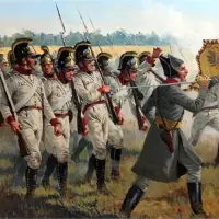
2te Preussische Leibhusaren
But does it really make such a difference? Is it just imagination?
Well the other day I was airbrushing some MDF terrain. amongst the pieces were two (actually more, but these were the ones I photographed) that will represent wood when done. Both had been primed*. One I had primed in off-white, since it will be part of buildings that are meant to re-present light coloured plaster. The other was primed black, since it will be part of a Bailey Bridge. (I do not want to paint the underside of the planks and neither do I want a light colour reflecting off the surface of my river. Out of pure laziness I primed both top and bottom the same.) I did spray two light coats of Vallejos Model Air “Burnt Umber” over them. Two light coats, since I wanted a shaded finish, that would make it easier to make it look like wood later on. Burnt Umber is a very dark brown, almost like chocolate with a high cocoa percentage. So what did they both look like?

Comparison between (off-)white and black primers
As you see, two light coats over the off-white primer gave me a result, that is slightly lighter than the brown itself. Two similar coats over the black gave me a result, where you will hardly notice the brown, if at all.
By the way, this also shows how one can use these primers to ones advantage while painting. If you have a paint with a low opacity, you can use a number of coats to change your colours and create shading on your minis. If you apply a number of coats over a dark colour your colour will become lighter with every coat (more so the lighter or brighter your colour). If you apply your colour over a light colour, it will become darker with ever coat.
Hope this gives some of you some insight.
[* It is always advisable to prime MDF before pairing it. MDF is essentially sawdust pressed into shape with glue. As such it will always “suck up” lots of paint in its natural state. Priming them means that a) they suck up your cheap primer instead of your expensive paints and b) you need less coats making your work faster and easier.]


von Peter himself
August 8, 2015 at 22:31
Hello Burkhard
An interesting post. I’m a black / dark undercoater normally. It’s the way I’ve been doing things for decades and I’m an old dog now who is happy with his old ways. Yellows etc can require multiple coats as a result but I feel that a ‘deeper’ colour results. I will usually paint a darker base colour on first for those colours that are not so good at covering, e.g. for yellow I’ll often start with an orange and for white a mid tan colour.
Of course all this messing around just slows my glacial painting speed down even further but in some (sick!) way I enjoy putting in the extra work!
Having said that I have used all sorts of colours for undercoats, mostly with horses.
Salute
von Peter himself
LikeLike
Burkhard
August 10, 2015 at 11:13
Hello vP.
No problem with that.. everyone his own! And your results vindicate your choice.
I think that is a big factor here, it highly depends on everyone own style, taste and time. As such I only wanted to give an idea why I do things and how the primer can affect the result. Hope I have been able to do that and everyone will be able to find his own way!
LikeLike
von Peter himself
August 12, 2015 at 11:17
Hello Burkhard
My comment was not meant to be in anyway a criticism, just a little “I did it my way” explanation. You have certainly presented a fine primer on priming. 8O)
Salute
von Peter himself
LikeLike
Burkhard
August 14, 2015 at 11:47
Oh no worries… I really meant that I enjoyed your comment. I have been buildings models for over 30 years now. About 15 years ago when I seriously got into miniatures gaming I started using primers. And virtually all the time off-white. After such a time, one can become biased and it is good to have someone give their opinion… makes things more balanced!
LikeLike
Dean
August 9, 2015 at 15:19
Thoughtful post on primers, Burkhard! For the record, I usually use either white or black; however, I’ve used brown sometimes – particularly on horses. I’ve yet to use grey though. That all said, I’ve not picked up a brush in sometime – too much yard work while the weather is good here in the Pacific NW. 🙂
LikeLike
Burkhard
August 10, 2015 at 11:17
Thank you Dean!
Well I have only been using black and off-white so far, at least for minis. Off-white purely for the reason that I can get a real good one at a DIY storer here in Germany (that costs less than half of the GW or Army Painter varieties), but that only come in off-white.
I have used other colors for vehicles only (the Vallejo Primers that you can put in the airbrush are really good for that). Regarding horses… I wish Vallejo did some (airbrush able) primers in good horse tones!
No matter what… I am glad you have found some other uses for the fine weather. I have to say, that I always keep an eye on your restaurant posts… hope I can remember half of your suggestions should I ever come to the SeaTac area again! 😉
LikeLike
Nysse
August 12, 2015 at 06:38
Interesting post Burkhard. I’ve found that even with lighter undercoats some shades just seem to be practically impossible to get working even with a few goes. Nowadays I usually start of with a slightly darker shade on the bottom and work up to the final. Like a very light brown and then working towards yellow. Even a white undercoat seems to shine through Vallejo yellow’s and I find working up from browns seems to give a more even result.
Personally I prefer to prime light gray. Gives a good middle ground and at least with the Vallejo airbrush primers it gives the most consistent result with least paint required. Black sometimes turns very glossy and the white needs to be applied very carefully as it seems to have a tendency for running away from larger flat surfaces towards edges, crevases etc. For vehicles I usually always prime black, followed spraying most visible surfaces with gray and a final highlight with white before applying thinned coats of the main colour. Gives a nice preshading effect.
Wouldn’t have expected that much of a shade difference to happen with the MDF stuff. Though I have a feeling that some might also have to do with MDF? It seems to take up a lot more of some shades than other. Might have to do with different pigment sizes etc. sealing up the layer more efficiently than others. Maybe the white seals it up better to allow for less paint to be used later.
LikeLike
Burkhard
August 14, 2015 at 11:56
I think some colors are hard to get right, regardless of undercoat. Two of those are yellow and red. Has to do with the type of pigments, which are semi-transparent in acrylic medium. There are only two ways around that… expensive pigments or adding white pigments. Most companies use the later on the grounds, that it is cheaper.
With yellows I found the ones fro Privateer Press and Andrea to offer a good opaquecy (I that actually a word?), with red the ones from Andrea are ace. I can not recommend either highly enough. All other companies can have the odd colour that is fine. Vallejo have a premier series of paints, which are good as well, but they are very bright… more like the High-Viz paint on Fire engines or police cars.
Regarding the airbrush primers from Vallejo… it sounds like you are applying too thick a coat. As with any other airbrush work, it should be a couple of thin coats rather than one thick coat. Usually that prevent the glossyness on the black and crawling into the corners on the white.
As I said, I also prefer grey primer. Some vehicles I still prime black as well, but I mostly reserve that for the ones with deep recesses.
With regards to the primer changing the shades on the photo. Could be, but I doubt that. Both to the eye or touch, they feel similar (which does not mean though, that they are the same on a microscopic level).
LikeLike